As you can probably see from the images and the title, this week I made my first efforts towards proper environment art. This includes the designing, modelling, texturing and scene composition. I chose an early, indoor area to model first. This was a very conscious decision to reduce the amount of assets I had to create before I felt that the scene was finished. Unfortunately, I did not quite finish everything in the 15 hours I spent on it this week (it is missing a lot of smaller props and stuff to make it feel more alive) so that is what I will be doing for the next week!
Modelling
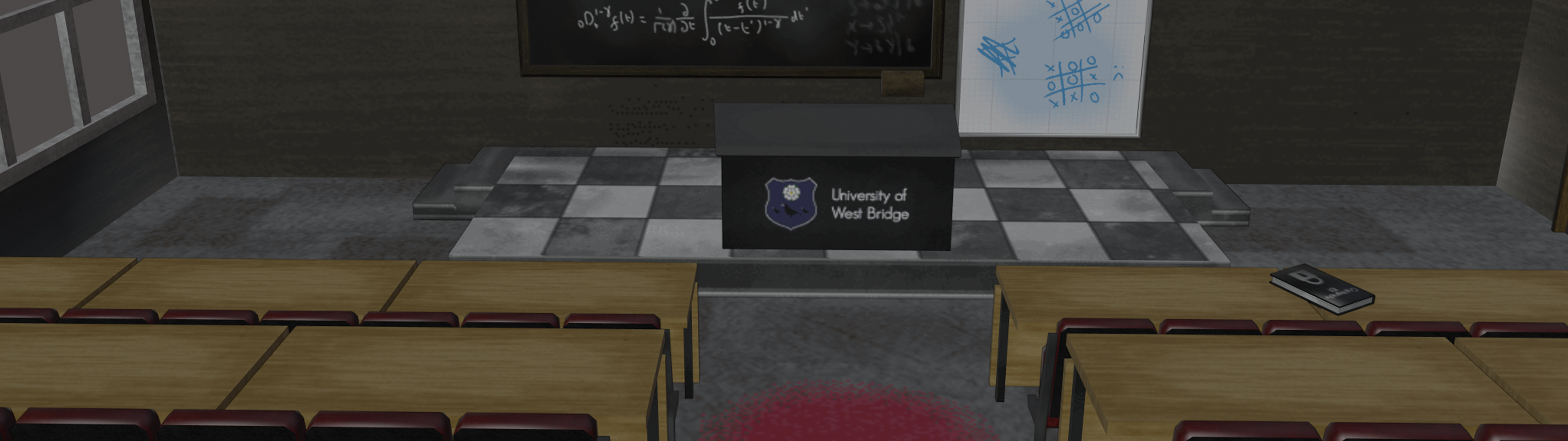
The first scene I chose to model is a lecture theatre. Part of the game is planned to be inside a university (pulling from experience!) which means lots of lecture theatres, cramped corridors and plenty of opportunity for unique rooms and set pieces. As you can probably see, I am going for a low-poly style. This is likely a good point to mention that all the screenshots in this blog post are from inside Blender. This is NOT what the game will look like in-engine! Also bearing in mind I am aiming for a PS1-style end product, it makes sense that I need to create low-poly models to achieve that effect.
Although saying all that, those that know PS1 hardware or are vaguely aware of its limitations may notice that even though I have gone low-poly, I am way over the limitations of the PS1. This is mostly just personal preference - a lot of games for the PS1 had to sacrifice a lot of their original vision to fit inside those limitations and I don’t really want to do that. I believe I can still achieve a believably retro-looking game without having to make those compromises.
Texturing
For texturing I used Photoshop to create diffuse and specular textures for each object. These were all hand-painted with additional texturing layered on top to add things like wood grain or grungey splotches. I also painted some ambient shadows directly into the textures. This is a style I’ve become accustomed to using instead of relying on more generative approaches you might find in modern games that use Substance Designer and the like to create their materials. I find this approach lends its own quirkiness and style to the scene, but also means a solo developer such as myself actually has a chance at creating detailed, hand-crafted scenes too!
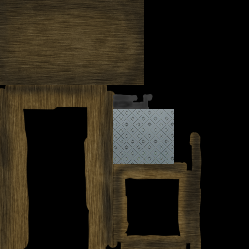
This is one of the diffuse texture maps from the scene. You can see that it is fairly simple and relies heavily on the wood grains to give it character. A neat trick that I always use to make things look a little more “worn” is to overlay a greyscale image of mould (seriously!) and blend it into the texture using the soft light blending mode in photoshop. I also reduce its opacity to make it more subtle. Not only does this add more depth to the material, but it also helps break up the repetitiveness of it. This trick works for all kinds of stuff and I tend to maintain an image bank of various textures that I can quickly overlay like this!
Scene Composition
For composing the scene, I relied heavily on reference images and my own experiences at university. Personally the lecture theatres I remember most and impacted me the most from university are the old, tired looking rooms. They have a certain amount of charm to them that the new, flashy and clean looking lecture theatres just don’t have. As I am making a horror game, it makes sense to go for old and battered looking stuff too!
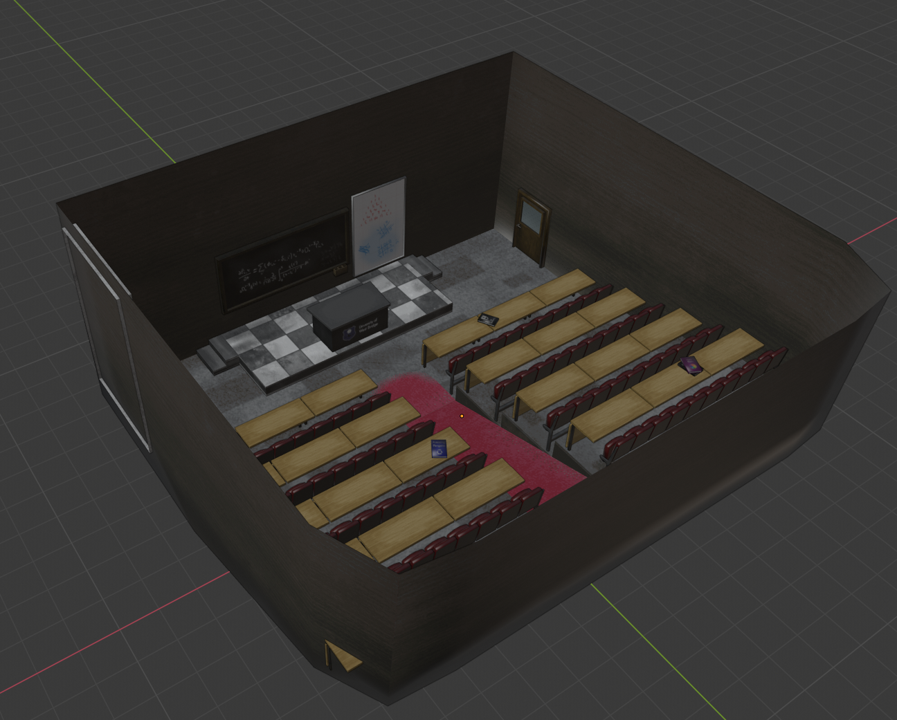
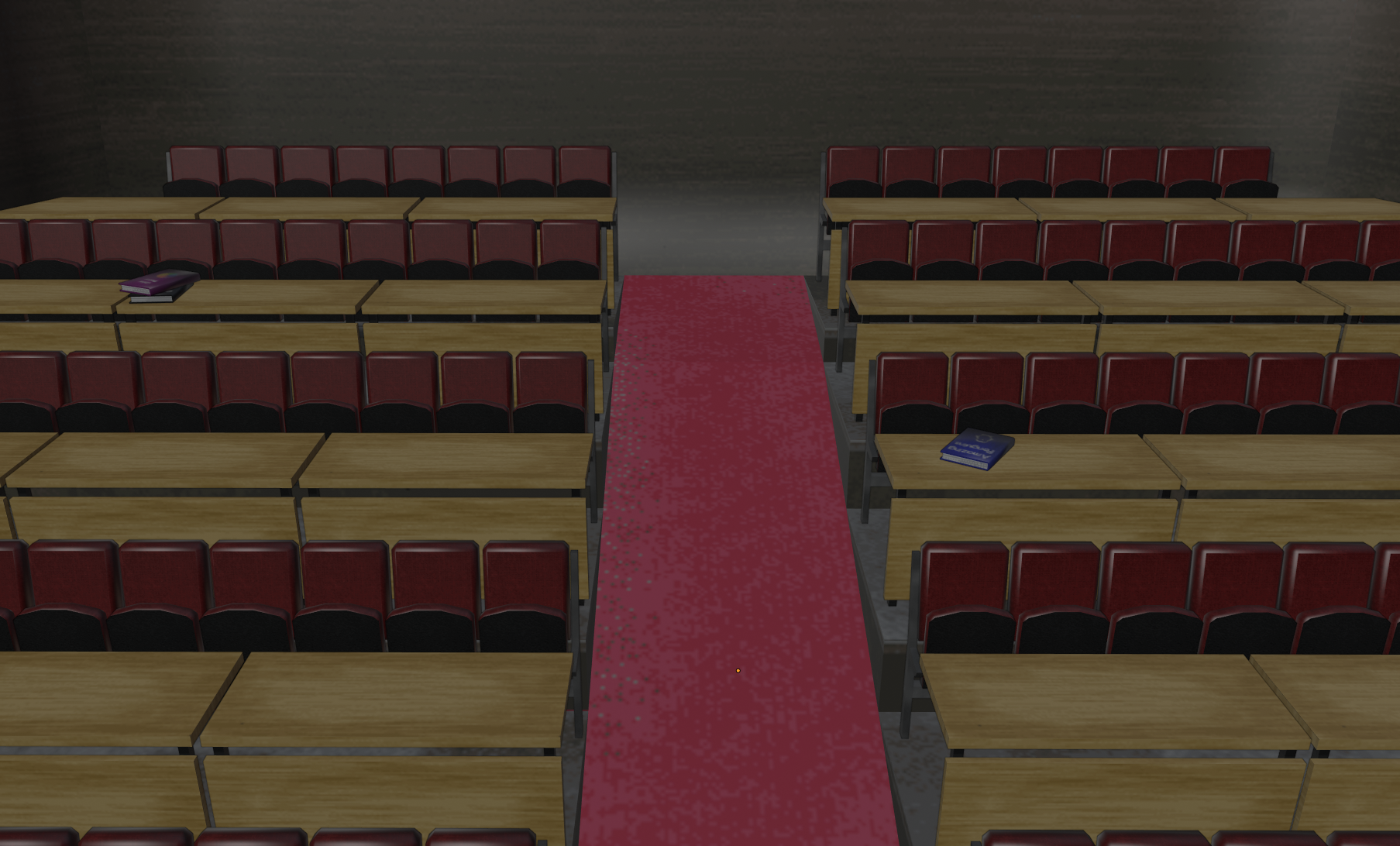
The scene as a whole is pretty unsaturated and bland besides for a few elements like the red carpet and the checkered floor of the stage. This was pretty purposeful as you know, horror, but those smaller “popping” elements I found necessary to include to make the scene have enough interest to hopefully engage the player and make the environment more memorable. It’s a really difficult thing to get right, but I’m trying!
As I mentioned already the scene is not actually finished by a long shot. Something I found unique about Silent Hill’s breed of survival horror is how detailed a lot of the scenes were. So much so that they still stand up well today. To properly achieve that Silent Hill feel, I will also need to add a considerable amount of smaller detail to my environments to make them look lived-in! I have a nice long list of smaller objects to make, so next week I should have a finished scene to show.
Moving Forward
That’s all for this week anyway. My plan going forward is to finish the lecture theatre off and start getting it into my engine. I mentioned last week that I need to optimise my collision code which I haven’t done yet and I also need to start paying more attention to lighting and shadow so I can make this scene look the best it can be. There’s a lot of work ahead!